Make a VRChat intro card
thamit includes a card generator for making self-introduction card images. It works without logging in, and you can download the finished card as an image — handy for social media icons and introductions.
How to use it
- Open /card.
- Pick a card type (there are several templates: Gamer, Avatar modder, Event cast, Creator, Writer, and more).
- Fill in the fields — display name, a short comment, social accounts, favorite things, and so on.
- Finish it up by picking images and adjusting the colors. You can also set a background image and a frame image (see "Fine-tune the look with a background and frame" below).
- Save the card as an image.
Arrange the items yourself (Custom)
Choose "Custom" as the card type to decide which items appear in the card body and how they are arranged.
- The body is split into four areas: Top (full width), Left column, Right column, and Bottom (full width).
- You can place Active hours, Likes & dislikes, Tags, Frequent worlds, Games I play, Events & appearances, Works gallery, and Owned avatars in any area, in any order.
- Move an item by dragging ⠿, or pick an area from the item's menu. The up and down buttons change the order.
- Move an item to "Unused items" to hide it from both the card and the form.
- Not sure how to arrange things? Press "Use a recommended layout" to automatically arrange the items you have filled in so they fit on the card. Each press switches to a different layout, so keep trying until you find one you like (items you have not filled in, and items that do not fit, move to "Unused items").
- The icon, SNS, name, attributes, and comment stay where they are.
The card has a fixed size, so too many items will not fit. A notice appears when that happens — remove some items or move them to another area.
Fine-tune the look with a background and frame
Open "Advanced settings" to fine-tune the card's look with images.
- Background image … Puts one image behind the whole card. You can choose your own image, or pick one of four ready-made backgrounds (Gingham Café / Diagonal Pop / Starry Night / Grid Notebook) under "Choose a ready-made background". You can replace or remove it later.
- Overlay strength … An overlay matching your color theme sits on top of the background image so the text stays readable. A stronger overlay keeps the text readable; a weaker one shows the image more clearly.
- Add panels behind text … When a background image is set, this shows translucent panels behind the name, SNS, and sections. Turn it off to show more of the background, or on when the text is hard to read.
- Frame image (transparent PNG) … Layers your own frame artwork on top of the whole card. Use a 1600×900px transparent PNG, the same size as the card. No overlay is applied and it covers the text and images too, so keep those areas transparent.
When you're logged in, you can also choose from your image library, as well as from your device. Background images can also come from Unsplash photos (frame images are transparent PNGs, so choose them from your device or image library). Both the background image and the frame image are stored only on this device and never sent to the server.
You can distribute or sell background and frame images you made yourself, on BOOTH and elsewhere. See Distributing and selling your own decorations for the rules.
Using the layout templates
When you make your own background or frame, use a layout template — a guide showing where the text and images sit — as an underlay so everything lines up. Under "Layout templates" in "Advanced settings" you can download the one for the card type you have selected. You can also save them from the links below.
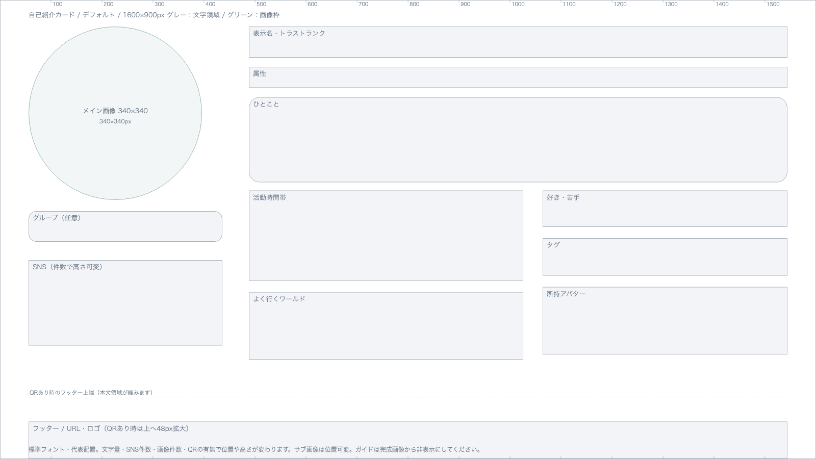
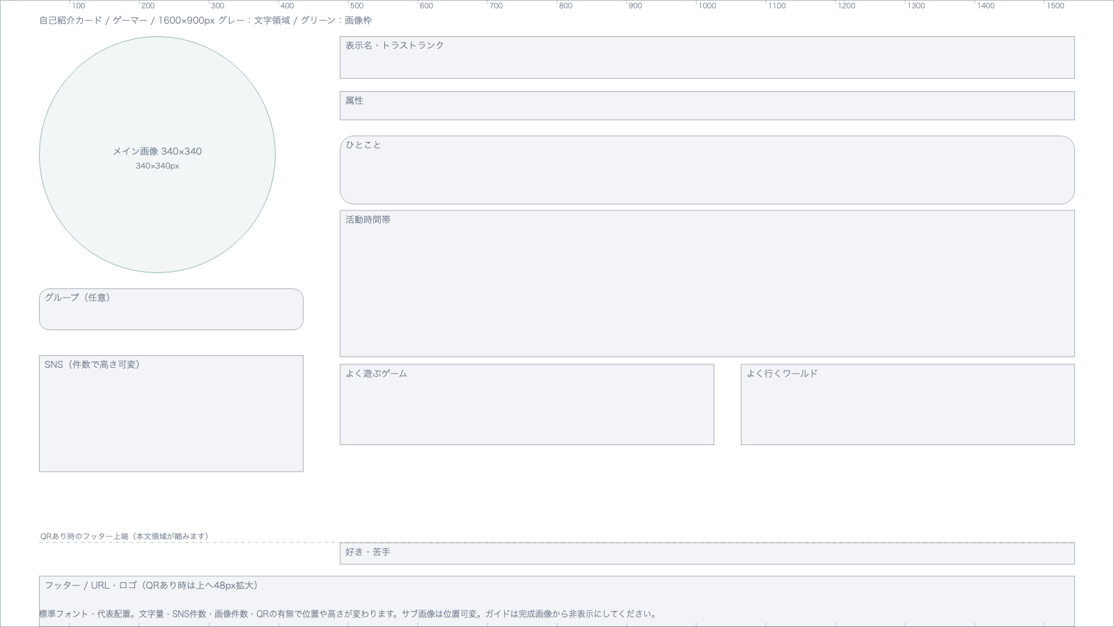
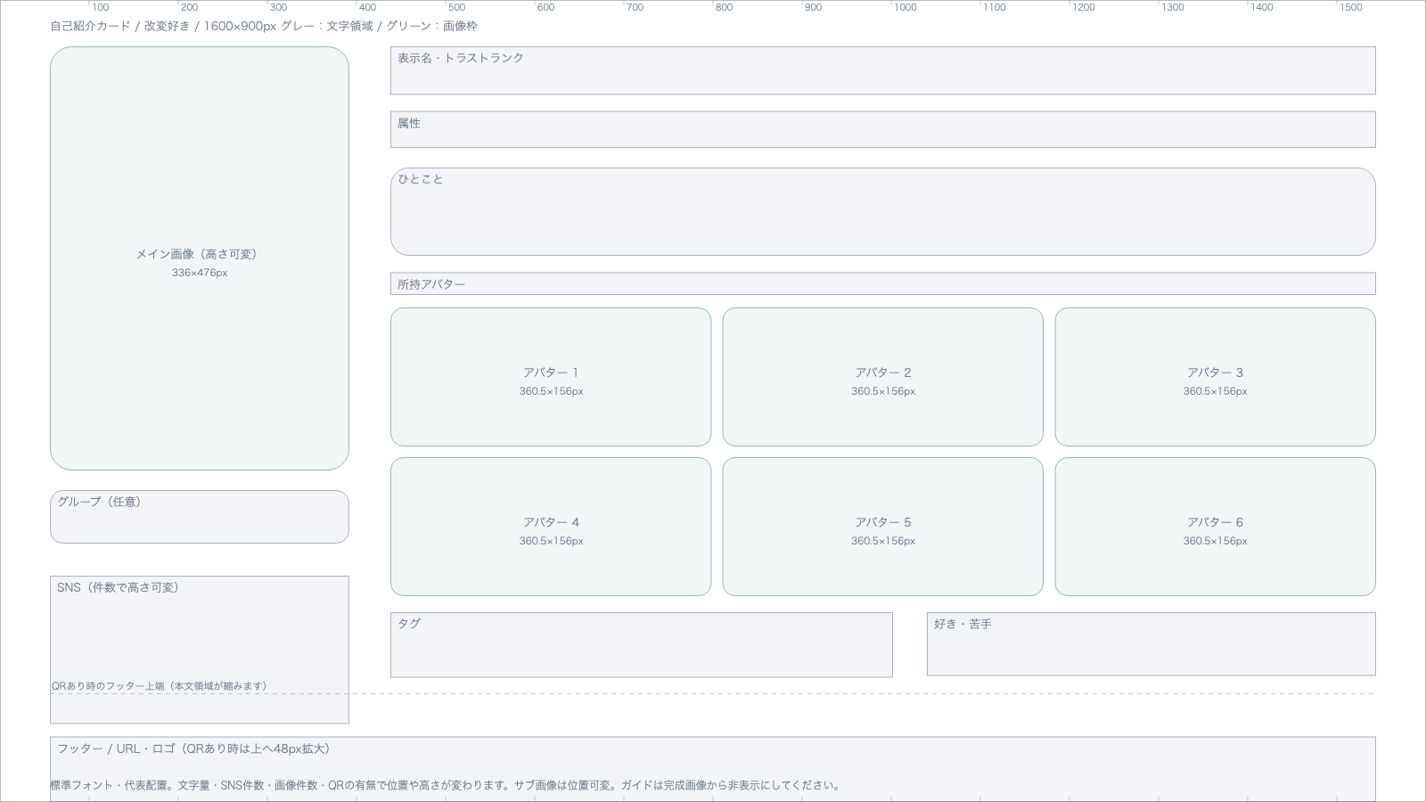
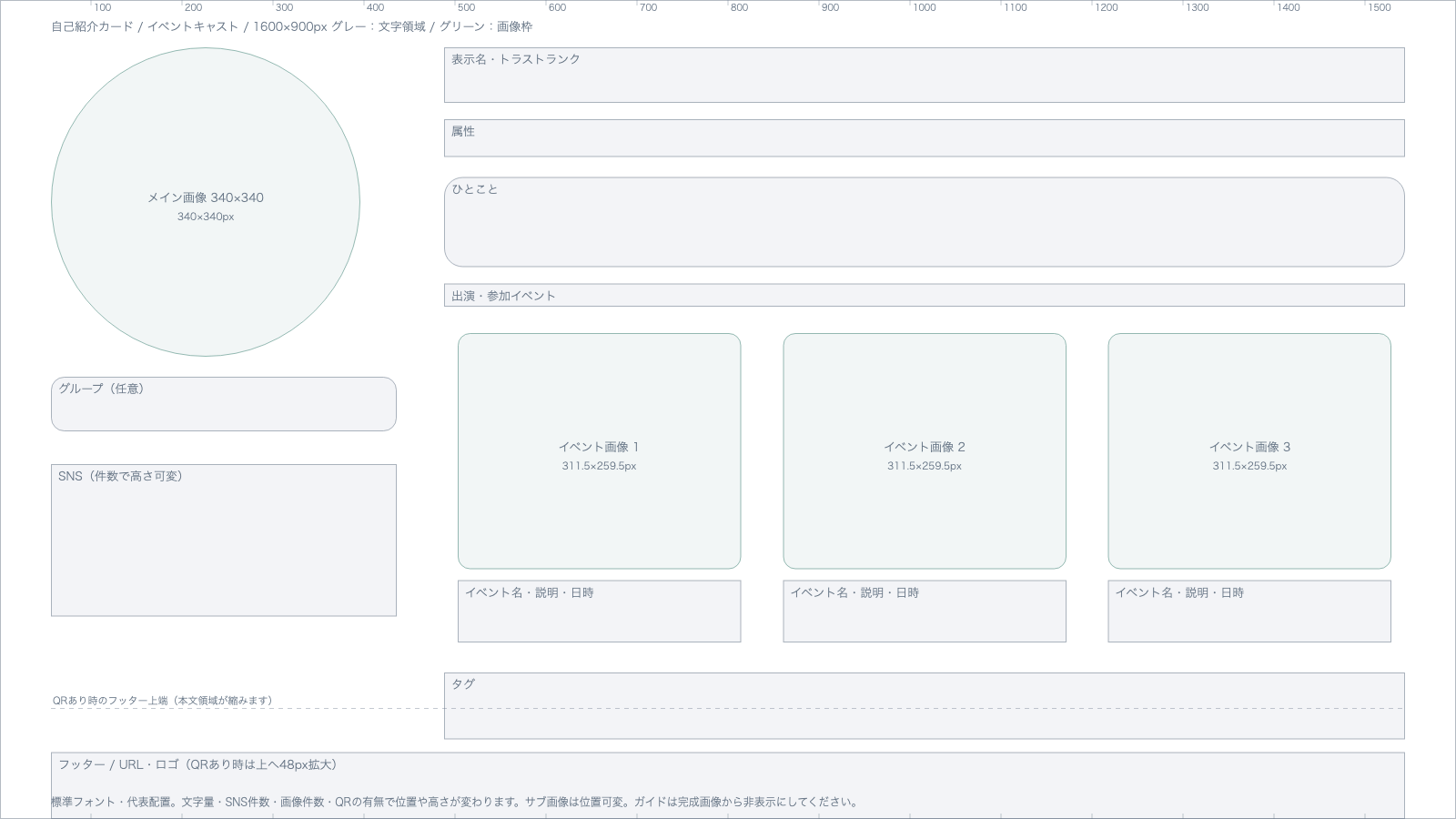
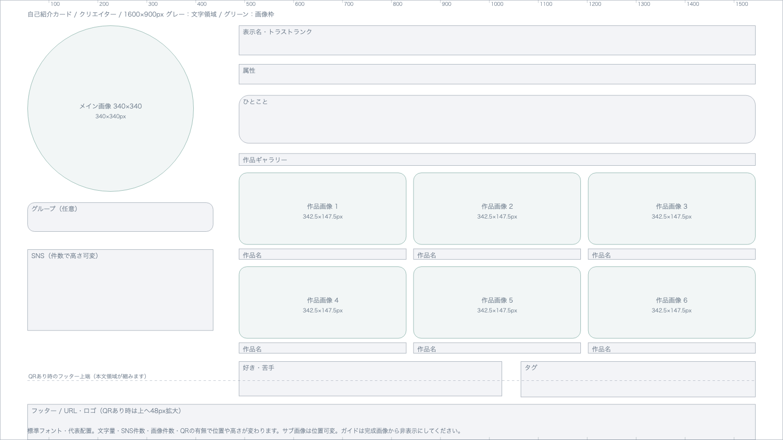
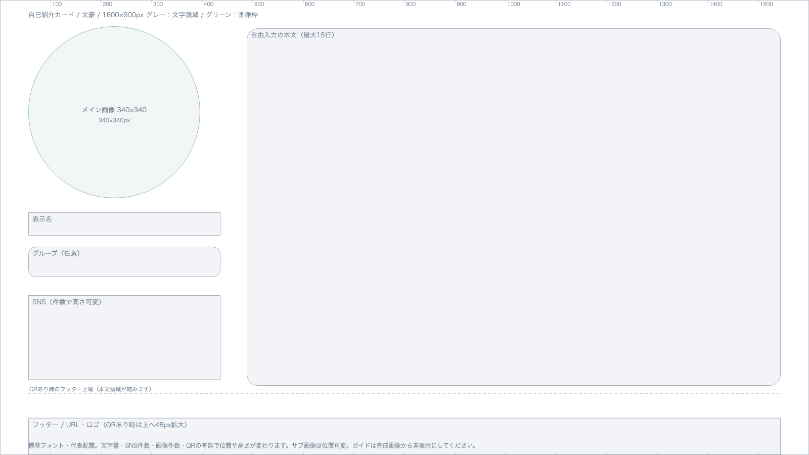
"Custom" has no layout template, because the arrangement differs from person to person. For a full list that also covers the schedule card and icon decorations, see Download all the creator templates.
All of them are 1600×900px transparent PNGs. Put the guide on its own layer in your drawing app and draw your background or frame around the gray text areas. Green marks the image frames. Hide the guide layer before exporting, and save frames as transparent PNGs.
The guides are based on the default font and typical content. Positions vary with text length, the number of images and SNS accounts, and whether the QR code is shown, so load your artwork into your own card at the end to check.
Save and share
When you save the card, the finished image is shown.
- "Download" saves it as an image file. On mobile, long-press the image and choose "Add to Photos", or use "Share or save the image" to send it to your photo app or social media.
- If you have a page, "Add to your page" adds the card to your page draft as an image block. If you added a card before, it is replaced with the new one. Adding it does not publish it — check it in the editor, then publish.
- If you put your profile URL in the VRChat field, the card shows a raw "usr_…" ID instead. If a notice appears when you save, we recommend re-entering your player name in the VRChat field.
What you enter stays on this device
Your card's content and images are stored only in your browser (nothing is sent to the server). On the same device and browser, you can come back and keep editing later.
Start a page from your card
If you sign up after making a card, everything you entered carries over into your thamit page. The color theme you chose for the card is used as your page's initial theme too.
We recommend this flow: start casually with just a card, and if you like it, move on to building your page.
Make a card from your page
If you already have a page, you can also create a card draft from your current page's content via the dashboard.